
Building the TikTok Shop SEA Product Card system and optimizing the Search Product Card for better purchase decisions.
Year
2025
Responsibilities
Product Design,
Design System
Company
TikTok Shop
(ByteDance)
Background
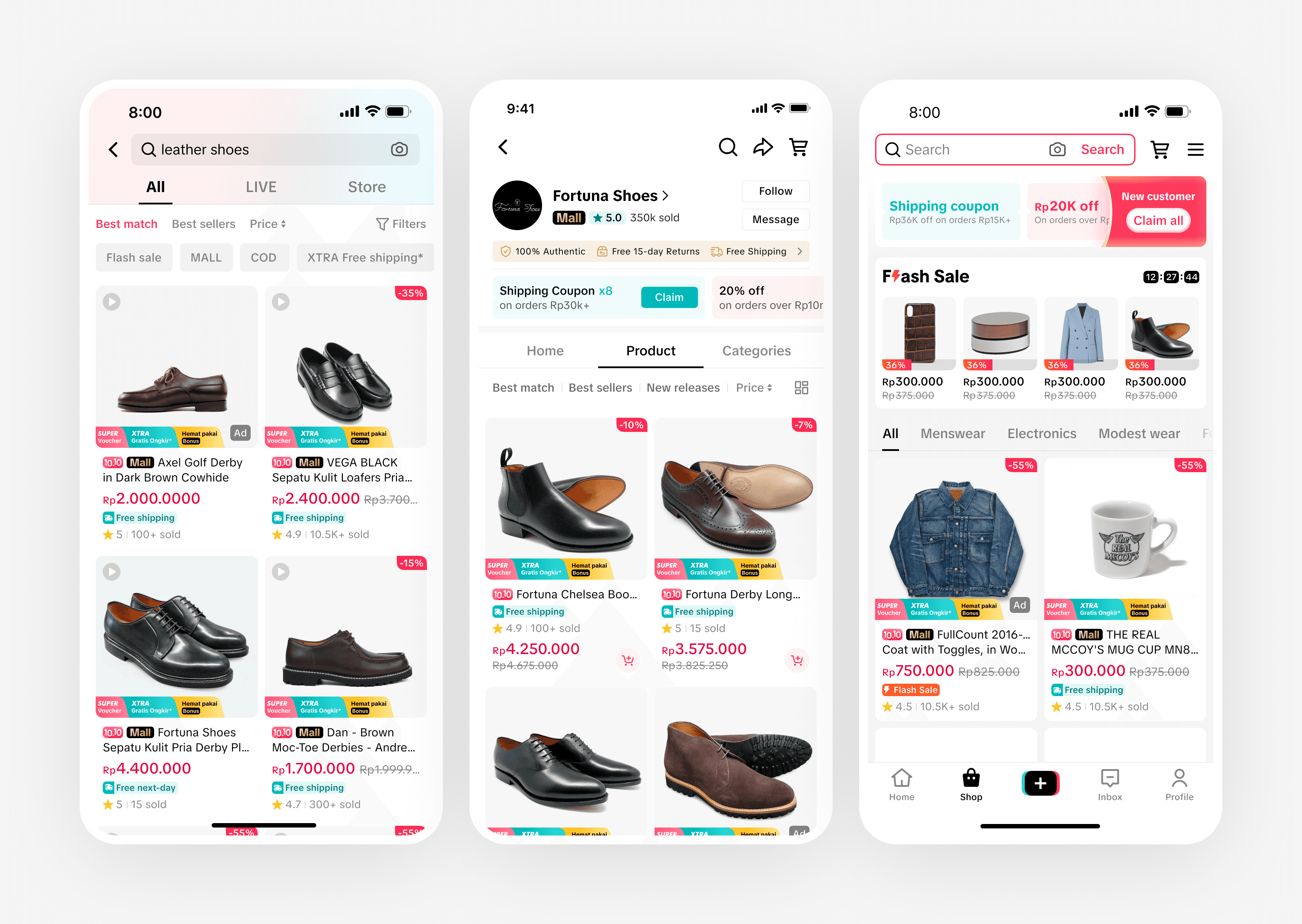
By 2025, TikTok Shop South East Asia had multiple business units each maintaining their own version of the product card — the core UI component used across Home page, Search experience, Store page, and Recommendation feed.
This led to inconsistent information hierarchies, fragmented visual patterns, and duplicated design and engineering work across teams. With 10+ component elements inside the product card, no two surfaces made the same decisions about what to show and how to style it.
At the same time, TikTok Shop was expanding into LATAM — adding Brazil and Mexico alongside the existing SEA markets — which made a scalable, localization-ready component system an immediate business need, not a future goal.
Separately, 2024Q4 field research across Indonesia, Malaysia, and Vietnam revealed that the Search platform's product card information hierarchy didn't match how users actually make purchase decisions, creating a clear product optimization opportunity on top of the systems problem.
Role and Responsibilities
As the Product Designer leading this initiative, I owned the end-to-end design work from component audit through to live A/B experiments.
Phase 1 - Building Product Card Component Library
01
Conducted a component audit across five major TikTok Shop SEA product surfaces.
02
Analyzed component composition, typography, image handling, and tile layout inconsistencies across all surfaces.
03
Defined the standardized product card architecture, including component classification and unified design tokens.
04
Created the single product tile component library (grid and carousel views) and wrote the cross-functional component guideline document covering 8 markets
05
Collaborated with the Design System PIC to review and publish the component to the TTS component library
Phase 2 - Product Card Optimization for Search Platform
06
Synthesized 2024Q4 SEA field research findings from Indonesia, Malaysia, and Vietnam
07
Audited live production issues on the Search Product Card and conducted competitive benchmarking across Shopee, Lazada, Taobao, and JD
08
Designed the Search Product Card optimization using a research-driven information hierarchy
09
Structured and documented a set of A/B experiments with defined objectives and metrics
Opportunity
Eliminating fragmentation and connecting design to how users actually shop
Across five surfaces, no two made the same decisions about which components to show, how to style them, or how to lay them out — and the inconsistency compounded with every business initiatives built on top.
How might we create a unified product card system that works across Southeast Asia and Latin America countries?
Users ranked what matters most — price, product image, and rating — but the existing Search Product Card hierarchy didn't reflect this, and existing condition analysis found active problems compounding the confusion.
How might we restructure the product card in Search platform to match how users actually scan and decide?
Key Strategy
One initiative in two phases: build the foundation, then apply it to the highest-impact surface.
Phase 1 - Established a unified product card system — resolving the fragmentation, defining the component architecture, and delivering a localization-ready component library covering south east asia and latin america.
Phase 2 - Applied the standardized system to the Search Product Card, using field research, production analysis, and competitive benchmarking to drive a hierarchy-first component optimization.
Design Process - Phase 1
Phase 1 - Established a unified product card system
1.1 - Understanding the current fragmentation
TikTok Shop's component library is structured in two layers: a global component library that covers core, app-wide components shared across all regions, and region-based libraries — like the TTS SEA Component Library — that extend the global system with components built for region-specific use cases and markets. The product card I was standardizing lives in the SEA layer.
I started with TTS Global Components as the reference baseline, then audited how each of the five pages in SEA market had diverged from it across four dimensions: component composition, typography, product image handling, and tile layout.

Component structure breakdown — how each of the surfaces layers its elements.

Component composition analysis — element presence, component height, and typography across all five surfaces.

Tile layout specs — padding, gap, indent, and inner spacing documented across all surfaces.
🔎 Key findings
01
We found a lot of inconsistencies across component elements — each surface had its own visual treatment with no shared standard
02
The final price used different typography styles across surfaces
03
Grid layout padding varied from 8px to 16px across surfaces with no documented reasonings

Analysis summary — component comparison, typography comparison, and tile layout comparison across all five surfaces.
1.2 - Defining the standardized system
Based on the audit, I defined which components should be standardized across all SEA surfaces by classifying them into two categories:
Core components: Product Image, Product Title, Rating, Promotion Labels, Price
Optional components: Selling points, Location, Brand name, CTA, Ad label
Core components are required on every surface. Optional components can be toggled based on each surface's context and business needs.
For typography, I defined a standardized style and text colour token for each component element — choosing the most commonly used values across the existing surfaces as the baseline.
For tile layout, I standardised three layout modes (grid, carousel, list) with consistent specs: 8px page margin, 8px tile gap, 8px internal padding, 4px inner vertical spacing.

Component standardization plan — defining core vs. optional components for all SEA product tile surfaces.

Product card skeleton — visual structure of the standardized component

Initial standardization preview — the unified card verified across Shoptab Search, Recommendations, Store Page, and Comprehensive Search.
1.3 - Delivering the component library and guideline
Working with the Design System PIC, I co-created and published the product tile component to the TTS SEA component library. The delivery included two formats.
The Figma component library covers: single and grouped product tile components in grid and carousel views, copy-paste usage layers with surface-specific page mocks, anatomy and properties documentation, UI specs for engineering handoff, dark mode support, and protected master and nested components.
The cross-functional component guideline document covers: component variants overview, tile background colour guidance with dos and don'ts, dimension and spacing specifications, colour token table, content guidelines with line limits and character counts, and full localisation previews and string tables for 8 markets — Indonesia, Singapore, Malaysia, Philippines, Thailand, Vietnam, Brazil, and Mexico.
Writing the guideline for a cross-functional audience — not just designer tooling — meant PMs and engineers could understand the system decisions and localisation requirements without needing to open Figma. This document was later used by the engineering team as the key reference for a product card architecture upgrade.

Component in use — the standardized tile rendered across Comprehensive Search, Shoptab Search, Recommendation Feed, and Store in both light and dark mode.

Component preview — product card variants across gray and white backgrounds."

Localisation — the standardized product card rendered across all 8 markets: Indonesia, Singapore, Malaysia, Philippines, Thailand, Vietnam, Brazil, and Mexico.

Component anatomy and properties — numbered elements with configurable properties covering aspect ratio, region variants, and states.

Content guidance — element labeling, max line limits, character count recommendations, and localisation rules for each component element.

UI specifications — spacing annotations, colour token assignments, and layout rules for engineering handoff.

Cross-functional component guideline document — covering component usage, colour tokens, content rules, and localisation specifications across 8 markets for designers, PMs, and engineers.
Design Process - Phase 2
Phase 2 - Search Product Card Optimization
2.1 - Understanding the Search Product Card problem
The redesign was built on three parallel streams of evidence: what users said mattered, what can we improve in the live product, and what the competition had already figured out.
User research from the 2024Q4 SEA field study (Indonesia, Malaysia, Vietnam) asked users to rank the top three most important pieces of information on a product card. Scores were calculated by assigning 3 points for 1st place, 2 for 2nd, and 1 for 3rd across all respondents. The results were clear: Price ranked first (score: 43), Product image second (38), Rating third (15), followed by Brand (10), Promotion (5), and Name (1).
The reasoning behind each top-ranked signal was just as telling as the ranking itself:
Price functions as a comparison baseline. Users scan prices across multiple products to assess whether a price difference is justified by quality or brand — it's the first filter in a rational purchasing decision.
Rating acts as a quick quality assurance check before committing to open the Product Detail Page. Users treat anything below 4.5 stars as a signal that the reviews are likely negative, which immediately removes the product from consideration. A strong rating increases trust and buying intention.
Product image is how users assess product details without ever leaving the Search Results Page. A complete, informative image can answer enough questions that users feel confident — or not — without needing to tap through to the PDP at all.
A separate research session with high-value buyers found that the Mall label — a key trust signal for credible sellers — was routinely missed due to its placement and low-contrast styling.

2024Q4 SEA field research — product card information priority ranking across Indonesia, Malaysia, and Vietnam.
Existing condition analysis identified three distinct live issues:
01
Unclear discount information — a card could simultaneously show a discount ribbon and promotion labels, making the actual total discount unreadable at a glance
02
Redundant information — the same campaign message appeared in both the product sticker and the product tag, wasting card real estate
03
No colour system — a single live product card was carrying 11 different colour usages (base, product title, shipping promo, bonus, extra discount, discount ribbon, Mall label, voucher label, rating icon, rating text, shipping icon) with no governing rule

Documented production issues on the Search Product Card — unclear discounts, redundant labels, and unregulated color usage.
Competitive benchmarking analysed Shopee, Lazada, Taobao, and JD across spacing, component structure, visual hierarchy, and colour palettes. It discovers that leading platforms lead with image and price, keep promotion signals secondary, and use constrained colour systems. TikTok Shop SEA's card was out of step with both user expectations and market norms.

Competitive benchmarking sample — Shopee analyzed across spacing, component structure, visual hierarchy, and colour usage.
2.2 — Designing and validating experiments
I started the ideation by defining a new information hierarchy before touching any design decisions. The framework organizes every component on the card into three priority levels — P0, P1, and P2 — each with explicit rules for typography, colour, and height.

Defining new information hierarchy — three priority levels grounded in user research, guiding every design decision.
The optimization focused on three categories: component spacing, information hierarchy, and promotion communication.

Space optimization summary — before and after showing recovered card height.
Space optimization — recovering vertical space to let P0 elements breathe
01
Reduced inner card spacing to increase the average number of products shown per session
02
Reduced product tile margin to show more information per view without expanding the card footprint

Space optimization — reduced inner spacing and tile margin to show more products per scroll.
Information hierarchy optimization — making P0 signals visually dominant
01
Focused price text on the main amount by reducing the size of the cents/decimal portion for SG, MY, TH, and PH markets — so users read the key number at a glance
02
Combined selling points and promotion labels into a single line, displayed by algorithm relevance — so users see the most relevant selling point for their search query rather than a stack of competing labels
03
Reprioritized component font weight and colours to reflect the new P0/P1/P2 hierarchy
04
Aligned selling point colour treatment with the Product Detail Page for visual consistency across the purchase journey
05
Centralized the total discount amount so users can understand the full discount in one glance rather than calculating it across separate labels

Information hierarchy optimization — price focus, selling point consolidation, and component reprioritization.
Promotion communication — rebalancing label visual weight
01
Experimented with promotion label style to create better visual balance with P0 components — testing whether a lighter label treatment would let price and image lead without losing the promotional signal

Promotion label optimization — experimenting with label style for better visual balance with P0 components.
Design Outcome
Phase 1 delivered a unified product card component and cross-functional guideline covering 8 markets. The component is now the shared foundation for product card design across TikTok Shop SEA and LATAM surfaces.
Phase 2 shipped optimized Search Product Card with an updated information hierarchy, reduced colour complexity, and improved scannability — aligned to how users in South East Asia actually prioritise purchase decisions.
Project Result
🏗️ Unified product card component published to TTS SEA component library
Covering grid and carousel views across 8 markets — Indonesia, Singapore, Malaysia, Philippines, Thailand, Vietnam, Brazil, and Mexico — with full dark mode support and cross-functional documentation.
📋 Component guideline enabled an engineering-led architecture upgrade for Shoptab Search
The standardized design output was used by the engineering team as the key reference for upgrading the product card's underlying technical architecture, ensuring design-tech alignment and reduced front-end inconsistencies.
Business results from the architecture upgrade:
Shoptab Search Android: daily orders per active user +0.69%
Shoptab Search iOS: average products shown per search session +2.41%, orders per 1,000 product views +0.53%
First-screen interaction loading time: −28ms (Android), −6ms (iOS)
Scroll frame rate: improved by 0.51 frames/sec (Android), 1.49 frames/sec (iOS)
🚀 Search Product Card optimization A/B tested and shipped in Q3 2025
📈 Phase 1 — UI hierarchy optimization:
Average number of products users viewed per session significantly increased by 1.28–1.39%
Product card click-through rate significantly increased by 0.12–0.15%
Daily paying users significantly increased by 0.24%
In Indonesia: daily orders per user +0.54%, daily paying users +0.44%
💰 Phase 2 — Promotion label optimization:
Shoptab Search GMV/DAU significantly increased by 0.38%
GPMS (GMV per 1,000 product card impressions) significantly increased by 0.41%
Shoptab Search GMV/Order significantly increased by0.41%

Next project
GoTo Unified Logins